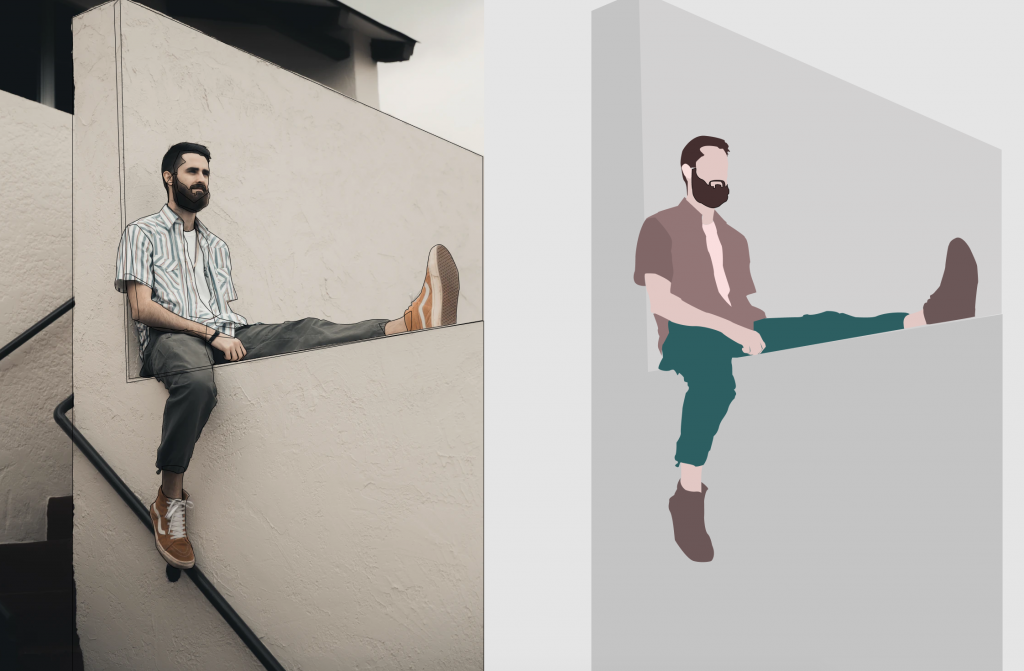
I’ve never had a real go at creating and animating my own SVG from “scratch” before, so I decided to test it out for a redesign of my artist-page.
Creating the SVG
I chose to use Figma to design the vector image, and I found an image from Unsplash to use for tracing.
Using mostly just the pen tool, I traced the different layers of the body. After I was finished, I removed the stroke, and added different fills and gradients to the various shapes. I also grouped the body parts that I wanted to animate together in named groups.

Before exporting the SVG, I made sure to tick Include “id” attribute, so that I could use the IDs of the named group to apply CSS animations.
Animating the body parts
The only real problem I encountered was that the transform-origin was off. To fix this, I had to apply two properties to the element: transform-origin, and also specifically transform-box: fill-box; (which means that the object bounding box is used as the reference box, as opposed to the border-box). After applying the transform-box fix, and setting transform-origin to where I wanted it on the different elements, the limbs would now rotate and move as expected when using transform.
Animating the text
A bit off topic, but in case you were wondering how I did the text effect, this is how – using clip-path:
h1 {
   position:relative;
   color:#fff; /* Make the text initially invisible - alternatively "transparent" or your background-color */
}
h1:before {
   content:attr(data-content); /* IMPORTANT: set data-content="your text" on the h1 */
   position:absolute; /* Defaults right on top */
   animation: h1Animation 2.5s ease-in-out;
   z-index:3; /* just make sure it's on top of everything */
}
@keyframes h1Animation {
  0% {
    clip-path: polygon(20% 0, 50% 0, 0 100%, 50% 100%);
  }
  25% {
    clip-path: polygon(0 0, 50% 0, 0 100%, 50% 100%);
  }
  50% {
    clip-path: polygon(0 0, 20% 0, 0 100%, 70% 100%);
  }
  100% {
    clip-path: polygon(0 0, 100% 0, 100% 100%, 0 100%);
  }
}
Animating elements into view when scrolling
I used the IntersectionObserver API to achieve the “fade in on scroll” effects on the different elements. Here is the code I used:
const observer = new IntersectionObserver(
  (entries, observer) => {
    entries.forEach(change => {
      if (change.intersectionRatio > 0) {
        change.target.classList.add("inView");
      } else {
        change.target.classList.remove("inView");
      }
    });
  },
  {
    root: null,
    rootMargin: "0px",
    threshold: 0.6
  }
); // Creating the observer and setting the callback and options.
const albums = document.querySelectorAll(".albums > a");
const soundcloud = document.querySelector("iframe");
const links = document.querySelectorAll(".blue ul li a");
const items = [...albums, ...links, soundcloud];
// Grouping up all the effected elements
items.forEach(item => {
  observer.observe(item); // Making observer observe them.
});
Final thoughts
It was surprisingly easy and quick to get a decent looking vector graphic done when using the tracing technique, and knowing that I have that potential makes me feel a lot more powerful as in what types of designs and animations I can create from here on out. I highly suggest anyone that hasn’t tried working with animating SVG to try this technique out, it will unlock a lot of opportunities!
If you want to see the animation live, then you can find it at this URL: https://haakon.underbakke.net/sl1ck